
An Insulin Curve Calculator helps visualize how your body’s insulin levels change over time in response to food or glucose intake.
By turning lab values or home test readings into a smooth, easy-to-read graph, this calculator gives you a window into how efficiently your body handles blood sugar. Whether you’re curious about insulin resistance, post-meal spikes, or fasting trends, it’s a practical educational tool for anyone interested in metabolic health.
⚠️ Disclaimer:
The Insulin Curve Calculator is provided for educational and informational purposes only. It does not diagnose, treat, cure, or prevent any medical condition. Calculated indices such as HOMA-IR or QUICKI can vary by lab method, population, and individual physiology. Always discuss your results and health concerns with a qualified healthcare professional before making any medical or lifestyle decisions.
Insulin plays a central role in metabolism—it moves glucose from your bloodstream into your cells, providing the energy your body needs. When insulin signaling works smoothly, blood sugar rises modestly after meals and returns to baseline within a few hours. When it doesn’t, the curve flattens, spikes, or lingers high, revealing early signs of insulin resistance or glucose intolerance.
In the following sections, we’ll explain what an insulin curve represents, why it matters, how the calculator works, and how to interpret your results responsibly.
What Is an Insulin Curve?
An insulin curve is a graphical representation of how your body’s insulin levels change over time—usually after you eat or after a standard oral glucose tolerance test (OGTT).
Each point on the curve reflects the amount of insulin your pancreas releases at a specific time, helping your body move glucose from the blood into your cells.
A typical insulin curve contains several key phases:
- Fasting baseline (0 minutes):
Before eating, insulin levels are low and steady, maintaining normal blood glucose levels. - Initial rise (0 – 30 minutes):
After carbohydrate intake, blood sugar rises. In response, the pancreas quickly releases insulin. - Peak phase (30 – 60 minutes):
Insulin reaches its highest point as it clears glucose from the bloodstream. - Decline phase (60 – 120 minutes):
As glucose is absorbed into cells, insulin levels gradually drop. - Return to baseline (2 – 3 hours):
In a healthy response, insulin and glucose both return close to fasting levels.
Healthy vs. Insulin-Resistant Curves
| Pattern | Insulin Behavior | What It Suggests |
|---|---|---|
| Healthy metabolism | Moderate rise, peak at 30–60 min, returns to baseline ≈ 3 h | Efficient insulin sensitivity |
| Insulin resistance | High, prolonged curve that stays elevated > 3 h | Reduced ability to use insulin effectively |
| Reactive hypoglycemia | Sharp peak followed by below-baseline dip | Over-response or delayed insulin clearance |
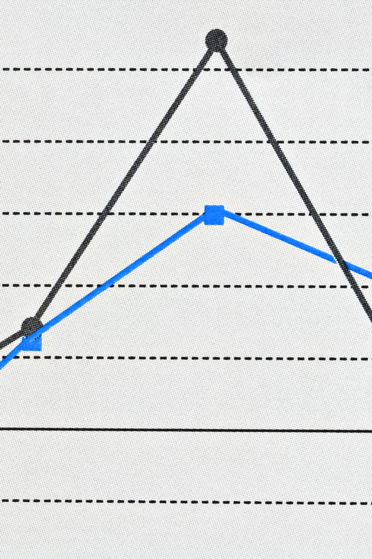
Visualizing these differences is what makes the Insulin Curve Calculator so valuable: it transforms raw numbers into an intuitive graph that anyone can interpret at a glance.
Why Use an Insulin Curve Calculator?
An Insulin Curve Calculator simplifies complex metabolic data into a visual story your body is already telling. Instead of staring at a list of glucose and insulin values, the calculator converts them into a smooth curve—revealing how your body reacts, peaks, and recovers after a meal or glucose challenge.
a. See How Your Body Handles Glucose
Your insulin curve shows how efficiently your body clears glucose from your bloodstream.
- A quick rise and smooth return to baseline indicates healthy insulin sensitivity.
- A delayed, prolonged elevation may suggest early insulin resistance—when your cells need more insulin to achieve the same effect.
- A sharp peak followed by a dip can indicate overcompensation or reactive hypoglycemia.
b. Detect Hidden Metabolic Trends
Many people with normal fasting glucose can still have abnormal post-meal insulin responses.
By plotting time-series data, the calculator helps you spot subtle trends such as:
- Higher-than-expected insulin peaks after modest carbohydrate intake
- Slower recovery back to baseline levels
- Gradually worsening patterns over weeks or months of tracking
These patterns often appear years before fasting glucose or A1C results show any issues—making the tool an early educational warning sign.
c. Compare Fasting and Post-Meal States
Because the calculator includes both a Simple (fasting) and Advanced (time-series) mode, you can explore your body’s insulin behavior from multiple angles:
- Fasting Mode: Quickly estimate insulin resistance using HOMA-IR and QUICKI.
- Advanced Mode: Plot insulin and glucose readings across time points for a full curve view.
d. Empower Lifestyle and Nutrition Changes
The calculator isn’t diagnostic—it’s a feedback mirror for your habits.
It can help you understand how specific meals, exercise routines, or fasting periods influence your insulin response. Over time, this awareness encourages smarter nutrition choices and more personalized metabolic care.
How the Insulin Curve Calculator Works
The Insulin Curve Calculator turns a few simple data points—your insulin and glucose readings over time—into a complete picture of your metabolic response. It’s built to be both educational and interactive, giving you immediate visual feedback.
a. Inputs Required
Depending on which mode you use, the calculator asks for slightly different data.
1. Simple (Fasting) Mode
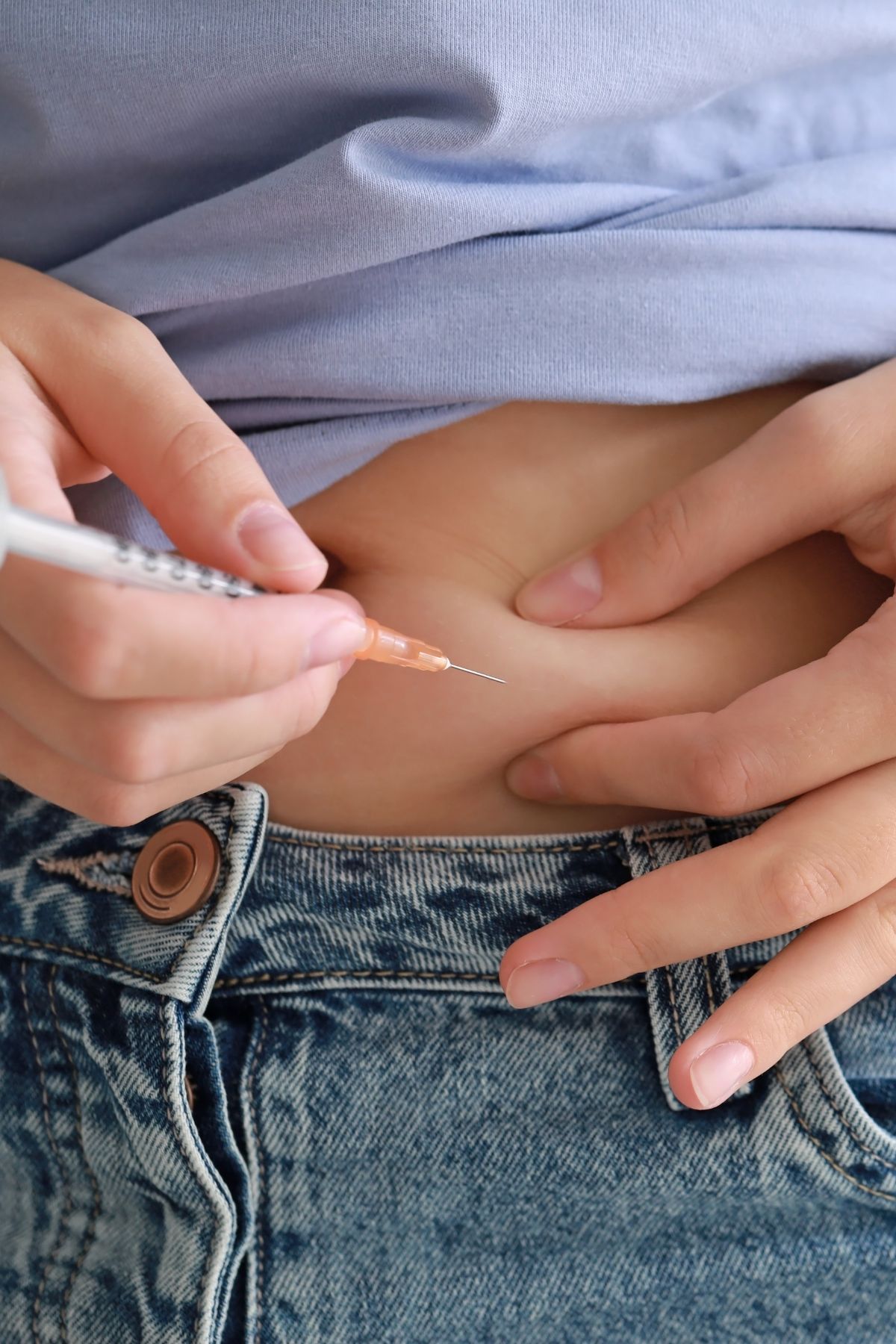
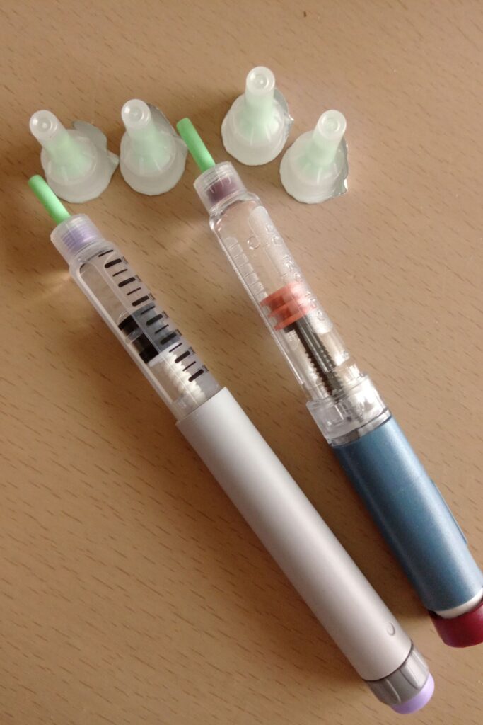
- Fasting glucose: Your blood sugar before eating, measured in either mg/dL or mmol/L.
- Fasting insulin: Your insulin level before eating, in µU/mL (micro–units per milliliter).
- Units selector: Converts mmol/L to mg/dL automatically (1 mmol/L = 18 mg/dL).
The fasting mode calculates two important indices:
- HOMA-IR (Homeostatic Model Assessment of Insulin Resistance)
HOMA-IR = ( Insulin × Glucose ) /405
(if glucose is in mg/dL)
- QUICKI (Quantitative Insulin Sensitivity Check Index)
QUICKI = 1 / ( log10( Glucose ) + log10( Insulin ))
2. Advanced (Time-Series) Mode
Here you can enter multiple time points—like 0, 30, 60, 90, and 120 minutes—along with the corresponding insulin and glucose readings.
This data often comes from an Oral Glucose Tolerance Test (OGTT) or from a controlled meal experiment.
Inputs include:
- Time (minutes)
- Insulin (µU/mL)
- Glucose (mg/dL or mmol/L)
You can add or remove rows freely, making it flexible for any test design.
b. Outputs Generated
Once you click “Compute & Plot”, the calculator performs several calculations instantly and displays:
| Output | What It Shows | What It Means |
|---|---|---|
| Graph (dual-axis) | Insulin and glucose curves plotted over time | Visualizes your metabolic response |
| Peak insulin | The highest insulin level and when it occurs | Timing of your body’s strongest insulin release |
| Return-to-baseline | First time insulin drops to ~10% above baseline | How quickly your body recovers |
| AUC (Area Under Curve) | Total “insulin exposure” and “glucose exposure” | Reflects the body’s total metabolic effort |
| HOMA-IR / QUICKI | (In fasting mode) indices of insulin resistance or sensitivity | Summarizes fasting metabolic efficiency |
The chart uses two vertical axes—one for insulin and one for glucose—so you can see how both respond in tandem. A healthy curve typically shows insulin peaking around 30–60 minutes and returning close to baseline by 2–3 hours.
c. Educational Purpose
These calculations don’t replace laboratory tests or medical evaluation—they’re meant to help you learn how glucose and insulin interact.
The calculator gives you context: if your curve rises higher or stays elevated longer than expected, it can prompt a useful discussion with your healthcare provider.
Using the Insulin Curve Calculator Step-by-Step
Let’s walk through how to use the Insulin Curve Calculator in both its modes so you can see what kind of insights it provides.
A. Fasting Mode Example
If you only have fasting lab results, you can quickly calculate your HOMA-IR and QUICKI.
- Open the calculator and select the Simple (Fasting) tab.
- Enter your fasting glucose — for example, 95 mg/dL.
- Select your units (mg/dL or mmol/L).
- Enter your fasting insulin — for example, 8 µU/mL.
- Click “Calculate.”
The calculator instantly computes:
- HOMA-IR: (95 × 8) / 405 = 1.88
- QUICKI: 1 / (log₁₀ 95 + log₁₀ 8) = 0.347
You’ll see the results displayed along with brief formula reminders and interpretation ranges.
These two numbers provide a snapshot of how efficiently your body responds to insulin in the fasting state.
⚠️ Reminder: Small day-to-day variations are normal. Track monthly or quarterly to see meaningful trends rather than focusing on a single reading.
B. Advanced Mode Example (Time-Series Curve)
If you have readings taken after a glucose drink or a carb-containing meal, you can plot your complete insulin-glucose response curve.
Step 1: Enter Your Data
Switch to the Advanced (Time Series) tab and fill in at least two time points — more points give smoother curves.
| Time (min) | Insulin (µU/mL) | Glucose (mg/dL) |
|---|---|---|
| 0 | 8 | 95 |
| 30 | 45 | 140 |
| 60 | 60 | 125 |
| 90 | 40 | 105 |
| 120 | 15 | 90 |
Step 2: Compute
Click “Compute & Plot.”
The tool will generate:
- A dual-axis chart showing insulin and glucose curves.
- The area under each curve (AUC) — a measure of overall exposure.
- The peak insulin value (here, 60 µU/mL at 60 min).
- The return-to-baseline time — when insulin falls within 10 % of the starting level.
Step 3: Interpret the Graph
- In a healthy pattern, insulin peaks within 30–60 minutes and drops near baseline by 2–3 hours.
- If the curve remains high or the return-to-baseline takes longer than 3 hours, it may indicate reduced insulin sensitivity.
Step 4: Compare or Track Over Time
Use the tool regularly—such as before and after dietary or exercise changes—to observe whether your insulin response becomes smoother or more efficient.
C. Educational Takeaway
Seeing your own data plotted visually helps connect cause and effect. A simple chart can reveal how meal composition, fasting routines, or stress affect your insulin dynamics—knowledge that supports better lifestyle choices.
💡 Tip: For consistency, collect samples or finger-stick readings at the same time intervals and under similar conditions each time you test.
Interpreting Results (Educational Overview)
The data from the Insulin Curve Calculator are most valuable when viewed as a pattern, not a single number.
Your results can help you understand how your body’s insulin response changes throughout a meal, a day, or over time.
Below is an overview of how to interpret key trends from both the fasting and advanced modes.
a. Understanding the Shape of Your Curve
Every person’s insulin curve tells a unique story about how efficiently their body uses insulin to process glucose.
| Curve Type | What It Looks Like | What It May Suggest (Educational) |
|---|---|---|
| Healthy insulin response | Insulin rises moderately, peaks at 30–60 min, returns to baseline within ~2–3 hours. | Efficient glucose uptake, good insulin sensitivity. |
| Prolonged or high curve | Insulin rises higher than normal and stays elevated longer. | Possible insulin resistance; body compensates by producing more insulin. |
| Sharp peak with rapid drop | Large spike followed by quick fall, sometimes below baseline glucose. | Possible reactive hypoglycemia (over-response of insulin). |
| Flat curve | Minimal change in insulin despite rising glucose. | Possible β-cell fatigue or reduced pancreatic function. |
⚠️ These patterns are educational. Only a qualified healthcare provider can interpret them in the context of lab results and symptoms.
b. Key Outputs and How to Read Them
- Peak Insulin
The calculator identifies the highest insulin value and the time it occurs.- Healthy range: Usually peaks at 30–60 minutes.
- Delayed peaks (90+ min) may suggest slower insulin release or delayed glucose absorption.
- Return-to-Baseline Time
Indicates how long it takes insulin levels to fall back to ~10% above baseline.- Healthy pattern: Returns within 2–3 hours.
- Prolonged return (>3 hours) may signal impaired clearance or insulin resistance.
- Area Under the Curve (AUC)
Reflects total insulin exposure during the test period.- Lower AUC: Indicates efficient insulin use.
- Higher AUC: Suggests your body needed more insulin to manage the same glucose load.
- Glucose AUC
Parallels insulin AUC but measures glucose levels over time.
Comparing both curves helps show how much insulin was required to control blood sugar. - HOMA-IR and QUICKI
- HOMA-IR gives a simple fasting estimate of insulin resistance (higher = less sensitive).
- QUICKI is the inverse measure (lower = less sensitive).
Tracking both over time can help reveal changes in metabolic health.
c. What Healthy vs. Insulin-Resistant Patterns Look Like
| Metric | Healthy Range (approx.) | Insulin-Resistant Pattern |
|---|---|---|
| Fasting glucose | < 100 mg/dL | Often 100–125 mg/dL |
| Fasting insulin | < 10 µU/mL | Often > 10–15 µU/mL |
| HOMA-IR | < 2.0 | > 2.5–3.0 |
| QUICKI | > 0.35 | < 0.33 |
| Insulin peak | 30–60 min | 60–120 min or longer |
| Return to baseline | 2–3 h | > 3–4 h |
| AUC (relative) | Moderate | High |
Remember: these numbers are not diagnostic thresholds.
They are reference ranges for educational interpretation.
d. When to Discuss Results with a Professional
If your results consistently show:
- Elevated fasting insulin or HOMA-IR,
- Low QUICKI (< 0.33),
- Insulin curves that remain high for more than 3 hours, or
- Symptoms like fatigue, cravings, or post-meal crashes,
it’s wise to bring your data to a licensed healthcare provider. They can interpret your results in the context of lab tests, symptoms, and overall health.
Limitations and Cautions
While the Insulin Curve Calculator can be an insightful educational tool, it’s important to understand its boundaries. The results you see are estimates—useful for learning about patterns, not for making medical decisions.
a. Accuracy Depends on Data Quality
- Home glucose meters and even laboratory insulin assays can vary by ±10–15 %.
- Small timing errors (e.g., measuring at 28 min instead of 30 min) can noticeably shift the curve.
- Always record the exact time, test conditions, and whether you were fasting or post-meal.
b. Variability in Individuals
- Factors like sleep, stress, hormones, caffeine, and exercise can all influence insulin response.
- Two tests performed on different days may produce slightly different curves even in the same person.
- This natural variability is why trends over time are more meaningful than single results.
c. Not a Diagnostic Test
The calculator does not diagnose diabetes, insulin resistance, or any other condition.
Clinical diagnosis requires standardized laboratory tests—such as fasting insulin, fasting glucose, A1C, or a physician-supervised Oral Glucose Tolerance Test (OGTT)—interpreted in the context of your medical history and symptoms.
d. Interpretation Requires Professional Input
If your calculated values appear high or low, consult a qualified healthcare professional.
A registered dietitian or endocrinologist can explain what your pattern means and, if needed, order confirmatory testing or suggest evidence-based interventions.
e. Educational Intent Only
This tool was designed to promote awareness and understanding of how insulin and glucose interact—not to replace clinical care.
Use it as a self-learning resource to discuss with your doctor, not as a substitute for medical advice.
⚠️ Important Disclaimer
The Insulin Curve Calculator and all accompanying explanations are for informational and educational purposes only. They are not intended to diagnose, treat, cure, or prevent any disease.
Always seek the guidance of your physician or other qualified healthcare provider regarding any medical condition or health-related questions.
Conclusion
The Insulin Curve Calculator is a simple yet powerful educational tool that helps you understand how your body responds to glucose and insulin. By translating numbers into a visual curve, it allows you to see the rhythm of your metabolism—how quickly your insulin rises after eating, how long it stays elevated, and how efficiently your body returns to baseline.
For people interested in metabolic health, insulin resistance, or blood sugar control, this calculator offers meaningful insight. It turns abstract lab data into a personalized picture of how your body works in real time.
However, it’s essential to remember that this tool is meant for learning, not diagnosing.
Insulin levels and their interpretation depend on many factors—genetics, diet, activity, and hormones among them. Always review your results with a qualified healthcare professional if you have concerns about insulin resistance, prediabetes, or any metabolic condition.